Common In is about exploring, through artistic practices, the power of the commons. For some artists, exploring means carefully investigating collective processes in the realms of care or ecology. For others, though, it means taking a more activist stance by contributing directly to the commons movement. The workshop Flying the Commons Flag, hosted by Natascha Hagenbeek did exactly that.
Natascha has for 10 years coordinated activities at ecological artproject I can change the world with my two hands, visualizing the nessecity of local and small-scale food initiatives, which made her into an inspiring artist-pioneer of the commons. One of the things she is working on as part of Common In, is a commons flag. Not by herself, but with many commoners through a cocreative process. Last Monday she presented (from 29m30s) a final concept of the flag at a conference at Pakhuis de Zwijger.


On 11 December we arrived at Natascha’s studio at the Brouwersgracht in Amsterdam. A sign hung outside saying: Flying the Commons Flag.
Inside Natascha was prepared: flag designs all over the place, writing materials and sketch paper. She invited not only commoners to this cocreative session, but also an actual flag expert by the name of Theun Okkerse.
An example of a succesfull flag is the LHTBQI+ rainbow flag. An Interesting story is behind this, Natascha told us,
with because the rainbow flag initially belonged to and was used to symbolize the cooperative movement, which overlaps with the commons movement. Rainbows have been used in flag designs more often, as in Rem Koolhaas’s design of an EU-flag meshing together colours from each member state’s flag.
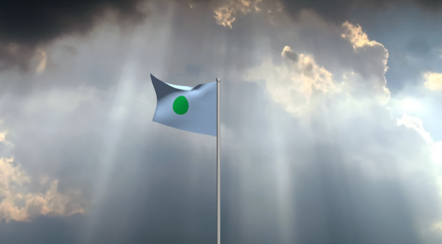
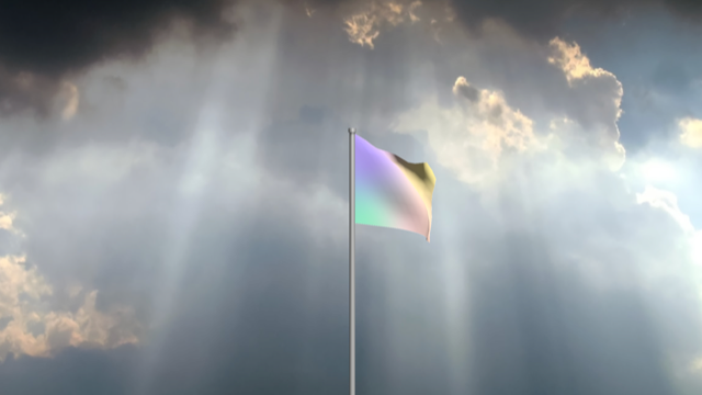
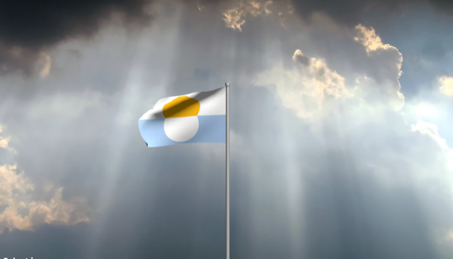
On the basis of her research with may commoners and experts (which these couple paragraphs cannot possibly do justice to), Natascha came up with four initial designs which served as inspiration for the session’s work.
Natascha kicked off the session with an introduction of the findings of her research so far. She took us on a tour by several flag designs that she had come across. Circular designs were a common thing in commons related circles, she explained, ‘look for example at the Creative Commons logo or the Commons Network logo’. But circular shapes are also used in the wider context of social movements and ngo’s, think of the United Nations or peace flags, which exist in different shapes and sizes. Related to this are earth flags, symbolizing either the circular shape of the earth on a flat background, or consist of ‘earth colours’ in different patterns.
An example of a succesfull flag is the LHTBQI+ rainbow flag. Interesting story, said Natascha, because the rainbow flag initially belonged to and was used to symbolize the cooperative movement (presented in 1925), which overlaps with the commons movement. Rainbows are used more often, as in Rem Koolhaas design of a EU-flag meshing together colours from each member state’s flag.
– Peace flag of Mexico (white flag with coloured half circle implying a white circle in the middle)
– Earth Flag (blue and white circle over a yellow and black background)
– EU Diversity Flag by Rem Koolhaas (colourful vertically thin-striped flag)
On the basis of this research (which these couple of paragraphs cannot possibly do justice to), Natascha came up with four initial designs for a commons flag that served as inspiration for the session’s work (against sky background).


Flag expert Theun Okkerse gave the group a few pieces of advice before we threw ourselves at it: look for a meaning of your shapes and colours, but don’t make the meaning stand out explicitly, ‘then it’ll become hard to read’. Second advice: consider the movement of a flying flag which makes the upper right square of the flag practically invisible. The group got to work. We were not yet satisfied with the preliminary designs. Different ideas were discussed that could inform a commons flag’s design. One of these was liberation. Liberation of pockets of society space from capitalism, that is. References were made to pirates and to the Dutch independence movement in the 16th century ‘de Geuzen’. Both flags of Geuzen and pirates (as well as the logo of the contemporary Pirate Party) were in a round shape, which inspired a few sketches (round purple and green flag).
Another idea was the notion of a flywheel, symbolizing the catalyzing force of the commons movement in the social and ecological transitions worldwide (blue and orange turning-wheel-like shapes in the centre). Every revolution starts with the work of pioneers before ideas enter the mainstream.
The idea of an animal mascotte was introduced, which would stand out and would contribute to the memorability of the flag. But whereas usually, large mammals are used like a wolf or a lion, the commons would be best characterized by ‘unseen’ animals like an ant or a bee: small but omnipresent and crucial to the health of the ecosystems.
Another idea was to symbolize in one way or another the three domains that exist in society: state, market and commons (blue-yellow-red triangular-shaped patterns). While there is obviously also the household that is a crucial domain, instutionally, it makes sense to talk about the commons as a kind of third domain next to the state and the market domains.


Natascha incorporated all the input and came up with a beautiful commons flag design, in black and white.
This flag design incorporates many of the features above: circular shapes (although half circles), a ‘flywheel’-ish moving feeling captured here in the form of ‘ripples’, the small half circle which resembles a small c which could stand for the commons, for cooperatives, collaboration or other commons-related terms and concepts which, serendipitous, often start with a c.
Stay tuned for further finetuning of the flag and – eventually – dissemination in the city!
